
A logo concept can look convincing in a large preview and behave very differently once it enters a launch campaign. The hero image may make its depth feel dramatic, while the same treatment becomes muddy in a small social avatar. A product mockup may expose a reflection that clashes with the surrounding colors. These differences are useful evidence, not reasons to abandon the idea immediately. A 3D Logo Maker can help a team create a dimensional logo image for early exploration. The next step is to test that image in the actual places where people will encounter it. A compact placement review can reveal which version belongs in a campaign, which needs revision, and where a simpler mark should remain in use.
Define the Placements Before You Pick a Favorite
Before using a 3D Logo Maker, list the three or four settings that matter for the upcoming launch. A typical small-team list might include a website hero, a social announcement, a profile image, and one product or packaging mockup. Do not begin with every imaginable channel. The purpose is to evaluate real decisions on a manageable set of surfaces. A 3D Logo Maker result only becomes useful when the team can see how it behaves in context.
For each placement, write down the approximate display size, background color, nearby text, and role of the logo. Is the mark the main visual or a quiet signature? Does it need to communicate without a caption? These details change what counts as success. A dimensional image that works as a hero illustration may be too complex to act as a persistent navigation logo.
Make a simple test grid
Place the same 3D Logo Maker candidate in each setting without redesigning it between frames. Keep a copy of the original flat mark in the grid for comparison. Use neutral mockups first so decorative scenery does not bias the review. Then add one realistic campaign treatment. If the dimensional concept is strong only when surrounded by dramatic lighting, the team may be evaluating the scene rather than the mark.
Check the Launch Page First
A landing page often gives a 3D Logo Maker concept more room than other channels. Use that space to see whether the finish helps explain the brand story. Compare the logo against both light and dark page sections, and inspect it beside the headline rather than alone. The 3D effect should establish a focal point without making the headline harder to read. A 3D Logo Maker concept with intense highlights can pull attention away from the message if every surface is equally bright.
Try a restrained crop as well as the full image. Cropping may turn a logo into an interesting background accent, but it should not make the brand name or symbol ambiguous. Review the page at a normal desktop width and a narrow mobile width. The intended visual hierarchy should remain clear in both. If the detailed treatment only works in the wide version, keep it as a hero asset and plan a simpler logo presentation for the mobile header.
Inspect the surrounding brand system
Look at type, color, and photography around the mark. A metallic finish may conflict with warm, natural product images; a soft volumetric gradient may blend into a similarly colored background. These are relationships, not isolated defects. Adjust the layout or choose another direction based on what the campaign needs. The 3D Logo Maker supplies a 3D-style image for exploration, while the full page determines whether that image earns its place.
Test Social and Mockup Use Without Losing Recognition
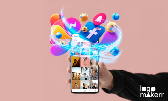
For social, test the 3D Logo Maker concept in a square post, a vertical story frame, and a small circular avatar. The square post may allow the complete logo to breathe. The story may need more empty space for a message. The avatar places the greatest pressure on silhouette and contrast. Reduce the image to the expected viewing size before judging it. A 3D Logo Maker output that keeps its outline at thumbnail scale is more versatile than one that depends on tiny reflections.
Mockups add another question: does the dimensional treatment still read like the brand when placed on a sign, product, or package? Use a realistic view, but avoid treating the mockup as proof of print or manufacturing quality. It is a visual discussion tool. Check whether the mark looks attached to the surface, whether the surrounding colors support it, and whether a simpler version might serve the physical application better. A 3D Logo Maker image may be best as campaign artwork rather than the file sent to production.
If the core mark itself remains uncertain, solve that upstream. An AI Logo Generator can help explore a basic symbol from a written description. Then the team can use a 3D Logo Maker to test a dimensional treatment of the chosen direction. This separates the question “what is our mark?” from “how should it appear in this campaign?” and keeps placement feedback focused.
Record a Decision for Each Channel
At the end of the 3D Logo Maker placement test, assign a simple outcome to each placement: use as shown, revise, use a simpler mark, or hold for a later campaign. Note the reason beside the decision. For example, a hero image may be approved because its shape and lighting support the launch theme, while an avatar may need a flat icon because the fine highlights disappear. Such decisions are more useful than a single vote on whether the concept is “good.”
Keep the tested image, the original source, and the placement grid together. If the team generates another version, it can compare like with like. Also describe the asset accurately during handoff: a 3D Logo Maker produces a logo image with a dimensional visual effect, not a rotatable or editable 3D model. Review lettering and other brand details closely before publication, since generated images may change them.
The goal is not to force one file into every channel. It is to learn where the new visual language helps people notice and recognize the brand. Used with a small, deliberate test grid, a 3D Logo Maker can turn a striking preview into a practical campaign choice with clear limits and a clear next step.