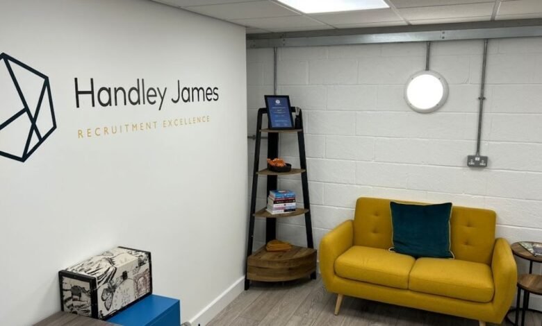

A blank wall says nothing about your business. Companies invest heavily in logos, colour palettes and printed material, then leave the walls of their premises completely silent. Visitors walk in and see an empty space where the brand could have been doing real work.
Wall stickers close that gap at a fraction of the cost of a full interior fit-out. Choosing the right design takes more thought than enlarging a logo, though. Artwork that looks crisp on a business card can lose all its impact stretched across three metres of plasterboard. The decisions you make about message, material, scale and colour separate a wall people notice from one they stop seeing within a week.
What Should You Consider When Choosing a Wall Sticker Design?
Here are six factors worth working through before any artwork goes to print:
1. Decide What the Wall Needs to Say
Every wall has a job. A reception space introducing your company to first-time visitors is doing very different work from a corridor graphic meant to lift the mood of a team on a Monday morning. Deciding on that job first prevents you from defaulting to a logo simply because it is the file you have to hand.
Once the purpose is clear, the design brief writes itself. Personalised wall stickers give you scope to answer that brief precisely, using your own words, values, imagery or product photography rather than settling for a stock pattern that could belong to any business on the street.
2. Match the Design to the Surface
The wall you are applying to shapes what is possible. Printed vinyl performs beautifully on smooth painted plaster, but brick, textured render and heavily grained surfaces need a conformable material and a design that survives being pressed into the texture. Fine hairlines and small text tend to break up on anything uneven.
Finish matters too. A matte laminate sits quietly and photographs well under office lighting, while gloss lifts colour and suits retail or hospitality spaces. Check the wall condition before committing, since fresh paint and dusty or flaking surfaces both affect how the adhesive bonds.
3. Simplify the Artwork for Wall Scale
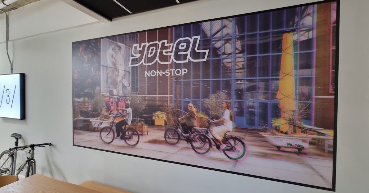
Brand assets are usually built for screens and print at hand-held size. Blown up to two metres wide, a full lockup with a strapline, registered mark and supporting text becomes cluttered and difficult to read from across a room.
Stripping elements back nearly always improves the result. An icon logo separated from the wordmark often carries a wall far better than the complete version, especially when it is paired with generous negative space. Ask what the design still communicates once you remove half of it, then remove that half.
4. Test Colours in The Room, Not on a Screen
Brand colours behave unpredictably once they leave the monitor. Cool LED strip lighting flattens warm tones, large north-facing windows shift everything cooler through the day, and a strong wall colour behind a partially transparent graphic will pull the printed shades towards it.
Contrast is the practical test. Dark walls usually call for a white underprint so colours stay true rather than sinking into the background. Ordering a small printed sample and taping it to the wall for a day costs very little and prevents an expensive disappointment.
5. Set Size and Height Around Viewing Distance
A graphic viewed from one metre in a narrow corridor needs a completely different treatment from one seen across a fifteen-metre open-plan floor. Work out where people will typically stand or walk, then size the design so it reads comfortably from that point.
Height deserves the same attention. Desks, radiators, filing units and door frames all interrupt sightlines, and a beautifully composed graphic loses its centre when a monitor sits in front of it. Mapping the furniture layout first avoids that problem entirely.
6. Be Realistic About How Long it Stays Up

Some designs are permanent fixtures. Others are tied to a campaign, a season or a set of figures that will be out of date within a year. Being honest about which one you are commissioning steers you towards the right adhesive from the start.
Removable options suit leased premises, short-term promotions and any content likely to change, since they lift away cleanly without damaging paintwork. Permanent installations justify heavier materials and more detailed artwork. Avoid dated content such as award years or team photographs in a permanent graphic unless you are happy to replace it.
Turn A Blank Wall Into Something That Works
A wall sticker earns its place when the thinking happens before the printing. Understanding the purpose of the space, the surface you are working with, the distance people view it from and the lifespan you need gives you a design that fits the room instead of fighting it.
Get those decisions right and the result feels intentional rather than decorative. Your brand becomes part of how the space functions, greeting visitors, giving staff something considered to look at, and quietly signalling that the business pays attention to detail.