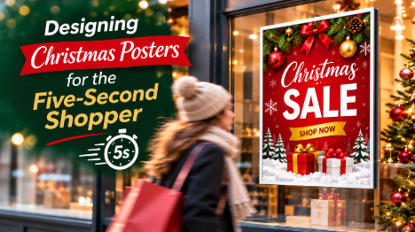

How to plan festive poster artwork around the way people actually move past windows in December, and the print decisions that help it hold up.
In December, the people walking past your shop aren’t really window shopping. They’re carrying bags, checking phones or working through a gift list in their heads, usually in a hurry and often in the dark by mid-afternoon. Your window gets a sideways glance as they pass, and that glance is all the time your Christmas posters have to make their case.
That changes what good design looks like. A poster that looks great on a laptop screen can be almost invisible at walking pace, however lovely the imagery or generous the offer.
Why Christmas Posters Get Less Attention Than Businesses Expect
The Five-Second Window
The “five-second shopper” isn’t a measured scientific figure. It’s a planning assumption, and a useful one. Assume a passer-by will give your poster a few seconds at most, and you’ll make better design decisions than if you assume they’ll stop and read.
Some people will stop, of course. But a poster has to earn that stop by saying something clear and relevant in the time it takes to walk past. Everything else is for the few who’ve already decided to pay attention.
Every Window on the Street Is Saying “Christmas”
The second problem is sameness. From late November, almost every shopfront and café on a UK high street switches to the same reds, greens, golds, snowflakes and baubles. Festive cues signal the season instantly, but they don’t say anything about your business.
When every poster on the street uses the same palette, festive elements stop helping anyone stand out. What gets noticed is contrast, clarity and an obviously relevant message. A slightly less decorated poster that’s far easier to read will often do more work than a prettier one that blends into the street.
A Five-Second Framework for Christmas Poster Design
A helpful way to plan festive artwork is to split those seconds into three jobs: one second to notice, two to understand and two to know what to do next. The timings are a rough way of thinking about it, not a rule, but they force useful choices.
The First Second: Getting Noticed Against the Real Background
Before anyone reads a word, the poster has to separate itself from its surroundings. That depends on contrast against the actual background it will sit in, not the white artboard it was designed on.
A shop window is a complicated surface. Behind the glass there may be lit displays, stock or a dark interior. In front of it are reflections of the street, headlights and the Christmas lights opposite. A deep red poster can merge into a red-themed display, and a navy design can disappear against a dim interior once it’s dark at four o’clock.
Before finalising the artwork, photograph the exact window at the time when most people pass and place the design over it. That tells you far more than a mock-up on a plain background.
The Next Two Seconds: One Message, Instantly Understood
Once someone has noticed the poster, they need to grasp what it’s about almost immediately. That means one headline doing one job. “Gifts for under £20 inside” works. “Celebrate the magic of the season with our exciting range of festive gifts, treats and stocking fillers” doesn’t, however warm it sounds.
A good test is whether the headline still makes sense if it’s the only thing someone reads. If it relies on the smaller text underneath to make sense, it isn’t doing its job.
Typeface matters here too. Decorative script fonts are popular at Christmas and look elegant up close, but from across a pavement, especially in low light, ornate lettering becomes much harder to read. A good compromise is a decorative font for a single word and a clean, bold typeface for the message itself.
The Final Two Seconds: Knowing What to Do Next
The last job is direction. For a shop, that might be “Inside now” or “Open late until 8pm”. For a Christmas event poster, it’s the date, time and place. For a restaurant, it might be “Book your Christmas party” with a short web address.
QR codes on Christmas promotional posters are useful, but only for people who have already stopped. They do nothing for someone walking past. Put the code where a person standing in front of the poster can scan it comfortably, and never let it replace a readable call to action.
Christmas Poster Design Hierarchy: What to Keep, What to Cut
Most weak festive posters aren’t badly designed. They’re overloaded, because the business has a lot to say in a short season. The table below shows how much each element matters to someone who only glances, and how to handle it.
| Poster element | Value to a five-second reader | Common mistake | Better approach |
| Headline or offer | Essential | Too long, or competing with other text | One short line, the largest thing on the poster |
| Festive imagery | Helpful for recognition | Fills the space and crowds the message | Use it as framing, not as the main subject |
| What to do next | Essential | Missing, or hidden in small print | A clear, short instruction near the headline |
| Dates and times | Essential for events | Set too small to read from the pavement | Large enough to read at passing distance |
| Logo | Moderate | Oversized at the expense of the message | Visible but secondary, ideally in a consistent position |
| QR code | Low for passers-by, useful for those who stop | Placed too high, too low or too small | Comfortably scannable at standing height |
| Terms and conditions | Very low at a glance | Cluttering the main design area | Small, tucked away, but legible up close |
Matching Christmas Poster Size and Placement to How People Pass
Viewing Distance and Angle
People rarely face a shop window head-on. They approach from one side and glance at an angle as they walk. Place your main poster toward the side most foot traffic comes from, so it’s in view for longer, and keep the key message around eye level. Posters placed low in a window are often hidden by displays, prams and queues.
There’s no single right size, because viewing distance varies from one site to another. The table below gives starting points rather than fixed rules.
| Setting | How people typically see it | Sizes worth considering | Design note |
| High street shop window | At an angle, walking past | Larger formats such as A1 or A2 | Short headline, high contrast against the window |
| Shopping centre unit | Closer, slower, but busy surroundings | A2 or A1 | Stand out from bright neighbouring units |
| Restaurant or pub entrance | Up close, often while deciding | A2 or A3 | Room for booking details and dates |
| Christmas market stall | Crowded, close, often under artificial light | A3 or A2 | Simple design, readable under stall lighting |
| Office or community noticeboard | Close reading, competing notices | A3 or A4 | Clear date, time and venue for parties and events |
Paper, Finish and the Window Problem
Finish matters more for Christmas window posters than many buyers realise. Gloss can make colours look vibrant, but behind glass, under shop lighting or low winter sun, it can add glare on top of the window’s own reflections. A silk or matt finish may help reduce that, so decide where the poster will hang before you choose.
Colour needs attention too. Screens make colour with light, while print uses ink on paper, so some very saturated reds and greens can look slightly more muted once printed. Artwork set up for print and a careful proof check reduce surprises. If a poster is going outdoors or somewhere damp, check the material is suitable rather than assuming standard indoor paper will cope.
Christmas Poster Mistakes That Waste the Five Seconds
Red text on a green background is a classic festive mistake. It feels Christmassy, but the two colours can be similar in tone, which makes text harder to read than it looks on screen. Small text on a busy photo is another, as is cramming every offer onto one poster instead of choosing the strongest.
Timing is the mistake people notice too late. A poster that goes up in the second week of December has missed a good part of the season, and one poster left up all month soon becomes wallpaper. A short sequence often works better: gift messages from late November, then last-order or late-opening messages, then festive opening hours or a post-Christmas sale. Christmas and New Year opening hours are especially useful to put on a poster, because shoppers genuinely want to know them.
Before approving any artwork, run a quick five-second check:
- View the design at full size from the distance people will actually pass
- Look away, glance back for a moment and note what you remember
- Check the headline makes sense on its own and the next step is obvious
- View it against a photo of the real window, in daylight and after dark
If you can’t remember the headline after that glance, the design needs simplifying, not more added to it.
Building a Festive Print Set Around Your Christmas Posters
Posters often work better as part of a consistent set. A gift shop that uses the same colours and illustrations on its posters and its branded Christmas wrapping paper links the window to the purchase, so shoppers leave carrying the design that drew them in.
Posters also help a single product find its audience. A bookshop promoting a new hardback book as a Christmas gift will usually do better with a poster built around that one title than one listing everything on the table.
For businesses with regular customers, it’s also worth thinking past December. A promotional calendar handed over at the till keeps the business in view through January, long after the Christmas posters have come down.
Ordering Christmas Poster Printing in Time for December
Even the best design can’t help if it arrives after the busiest weeks. Work back from the date you want the posters up and leave a buffer, because December is busy for printing and post across the UK.
- Decide where each poster will go and how far away people will be when they see it
- Choose the size and finish for each location, considering glare and lighting
- Write one clear headline and one next step for each poster
- Prepare print-ready artwork at the correct size, with bleed and high-resolution images
- Check the current production turnaround and order with time to spare
When the artwork is ready, you can order printed Christmas posters from I YOU PRINT online, choosing the size and options that suit each location, with UK delivery and support on hand if you’d like a second look at your file before it goes to print.
Christmas Posters That Work at Walking Pace
The shoppers passing your window in December aren’t ignoring your posters. They just don’t have time for them. The Christmas posters that succeed are designed to be glanced at, not studied.
Make the poster stand out from its real background, give it one message that makes sense on its own and tell people what to do next. Choose the size, finish and position to suit how people actually approach, and put the posters up early. Get those right and a passing glance has a far better chance of turning into a step through the door, which is what every Christmas poster order at I YOU PRINT is printed to support.